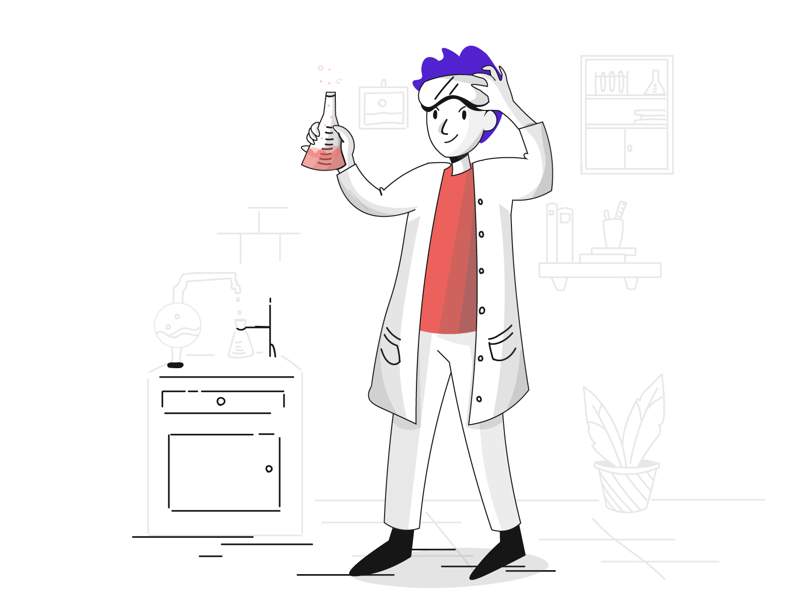
StaySafe is a mobile app designed first and foremost for safer travel. It features maps with safety ratings, matching with other users, and ride sharing integrations.
Introduction
It all started one night when I was browsing different major cities to work and live in. They all looked great, but I wondered how safe they really were to live in. As I began my research into the safety of the cities, a question arose:
“What if there was a way to quickly and conveniently check how safe a specific area was?
After consulting multiple websites and maps, I was only able to get a vague sense of the good and bad areas of the city. How does the average person know the dividing lines of where a good area ends and a bad area begins?
Unless you have lived in a major city for a while, it can be hard to know what the safest areas are. This is often well-known for residents but harder to come by for visitors and those just moving in.
This leads us to the problem:
There is no quick and easy way to look up a specific area’s relative safety and visually identify where that safety begins and ends.
So, what would a solution to this problem look like?
Mockup by Tran Mau Tri Tam - dribble.com/tranmautritam

As lead Product Designer on this project it was my job to conduct:
- User Research including competitive heuristics analysis and user
interviews
- Ideation
- Wireframes in both low and high-fidelity
- Usability Testing

In order to begin gathering data I created a screener survey to recruit people for interviewing. By screening the results received from the survey I was able to ensure my participants would be in my target demographic (over eighteen years old and travels to or lives in a major city).
Five interviews were then conducted where participants were asked about the importance of safety to them and their relevant experience with it while in a major city.
A great quote from one of the interviews was:
“Even when you've done your research on a bad area, if you’re unfamiliar with it, sometimes you don't know if you've already entered it or not.”
Aha!
This helped reaffirm my initial hypothesis and drove my vision for a safety-focused app featuring a map that could clearly show the dividing lines of each area and its related safety.
Based on the results from the interviews, I went on to utilize affinity and empathy mapping to synthesize what I had found into actionable data.
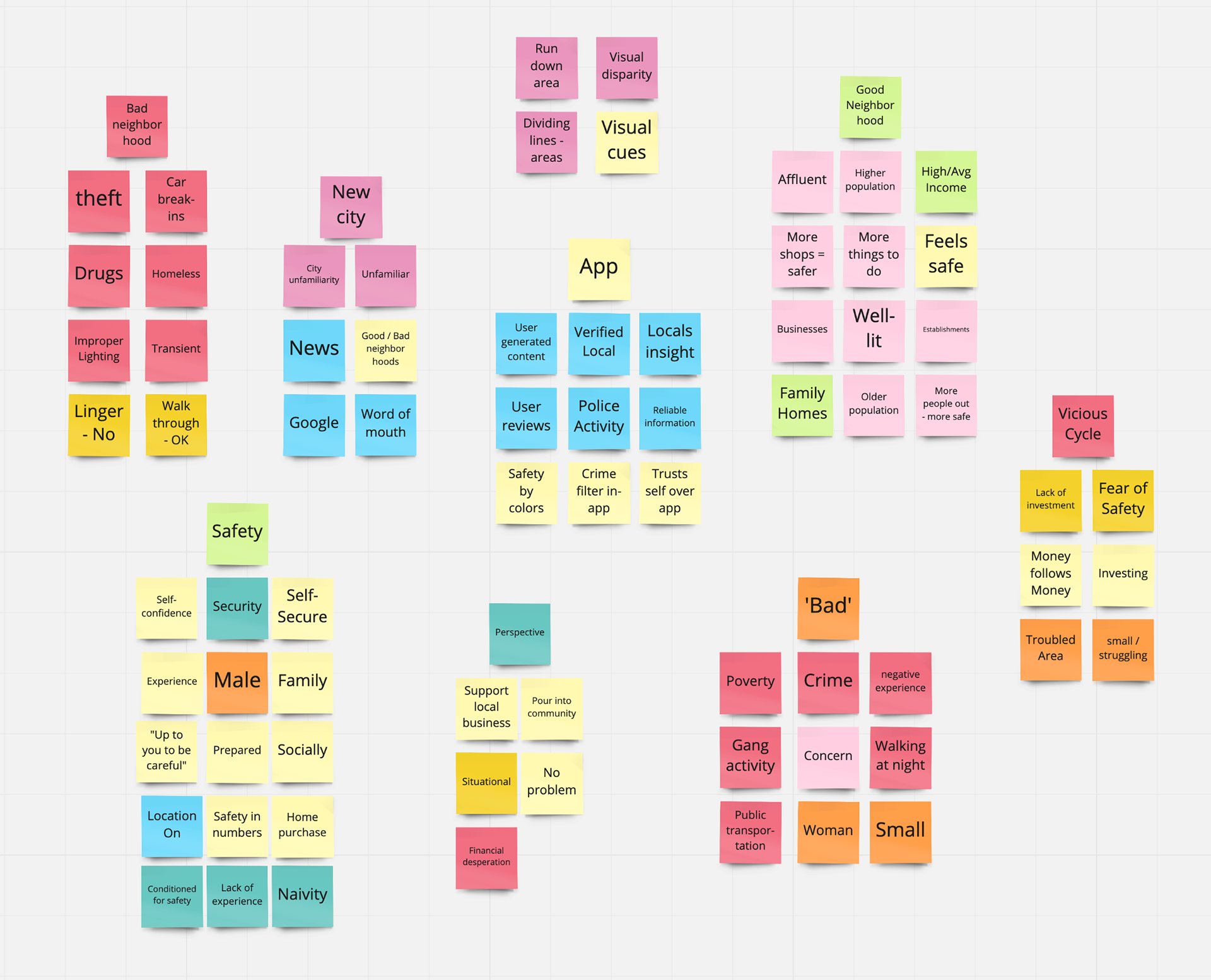
Using the affinity map I found that people often associate safe areas with:
- Affluency
- Good lighting
- Higher population.
Areas that would be considered unsafe were associated with:
- Homeless population
- Drug prevalence
- Poor lighting
- Crime.
Empathy Maps
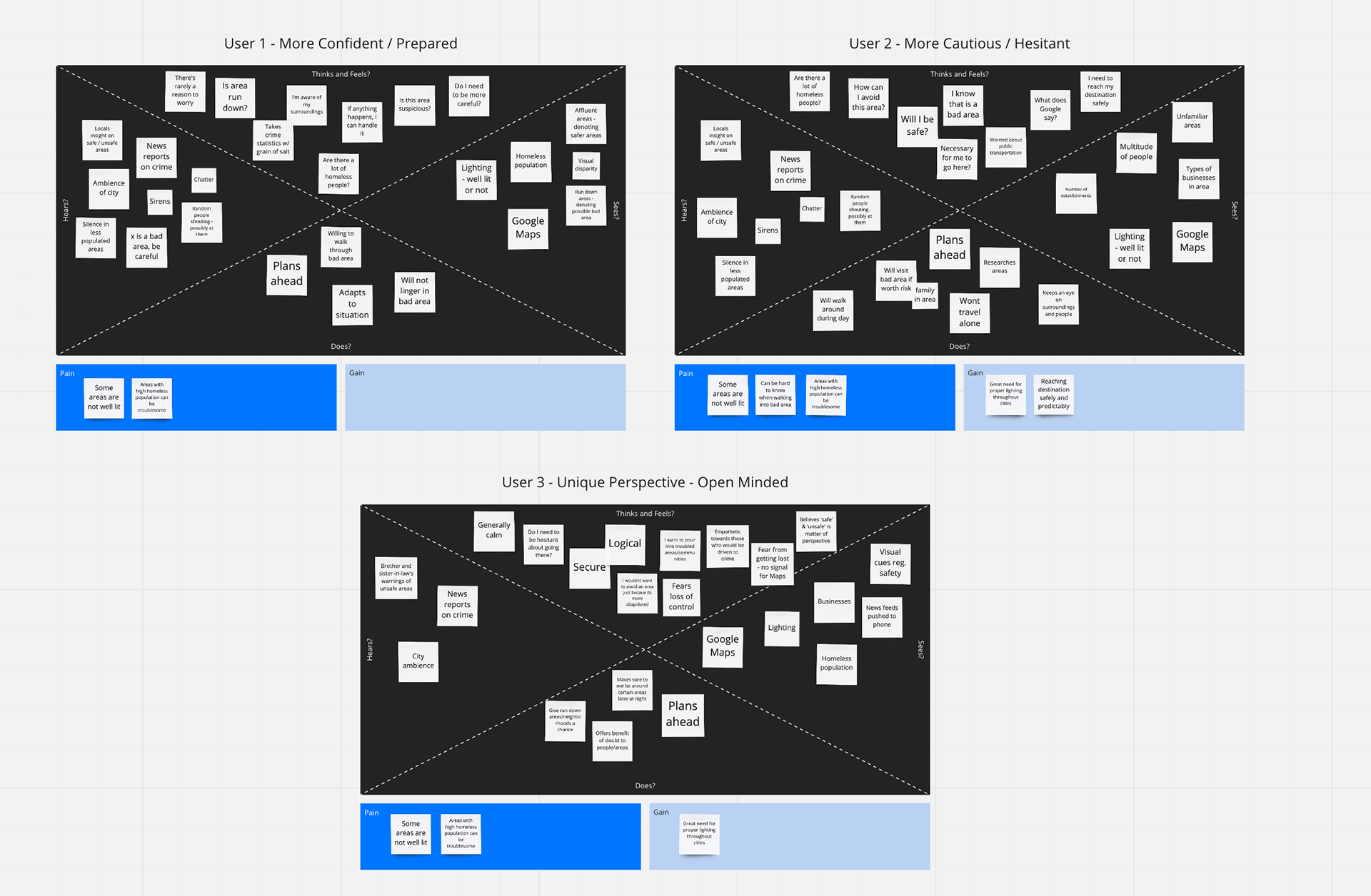
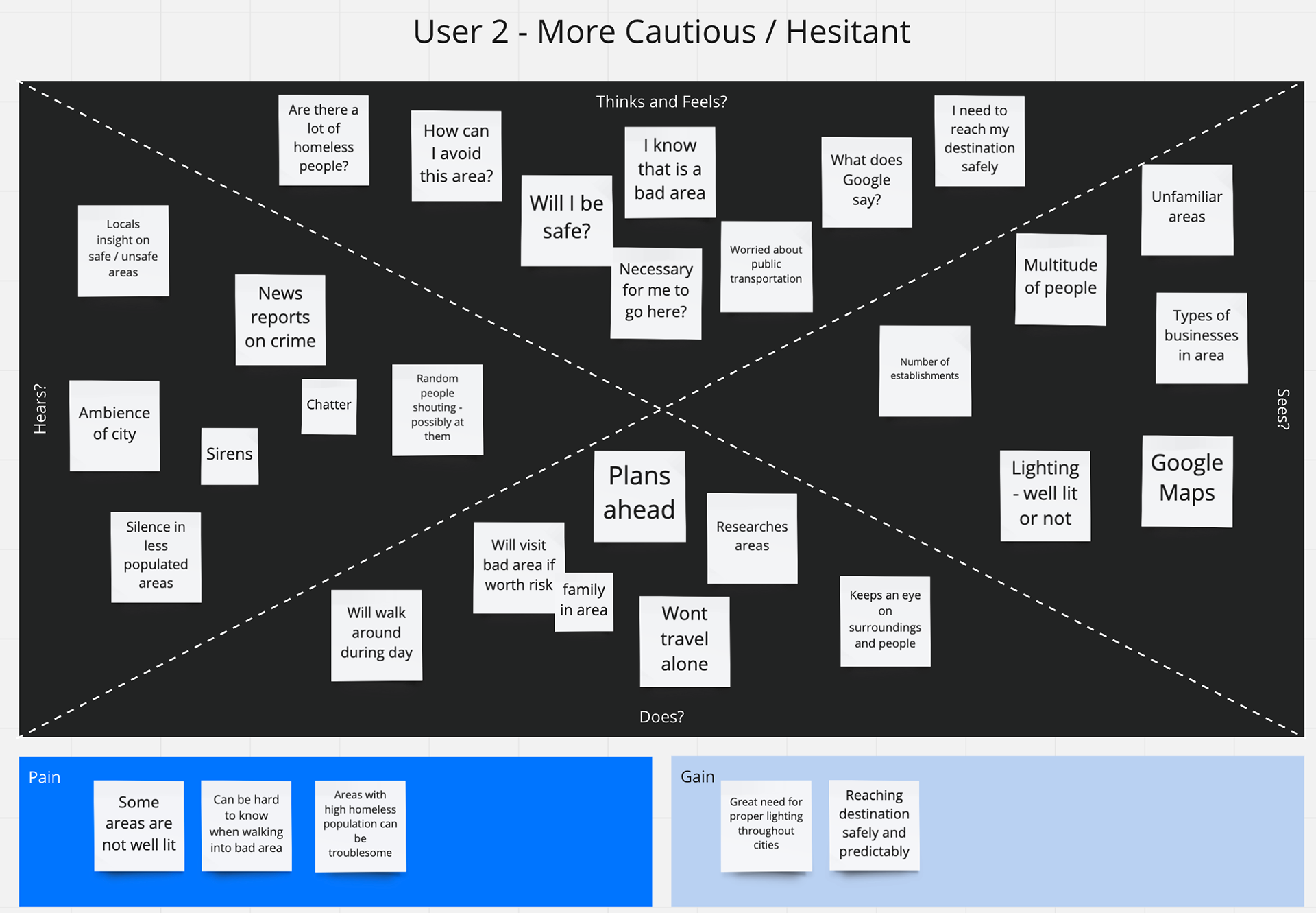
Creating Empathy Maps for the three user types identified (confident, cautious, open-minded) helped show that users wanted above all else to reach their destination safely. Another common concern was the need for proper lighting while traveling at night.
By stepping into the shoes of these three user types, I was able to better empathize and understand them.
With this information in hand it was time to give faces to these personality types by creating three unique Personas.
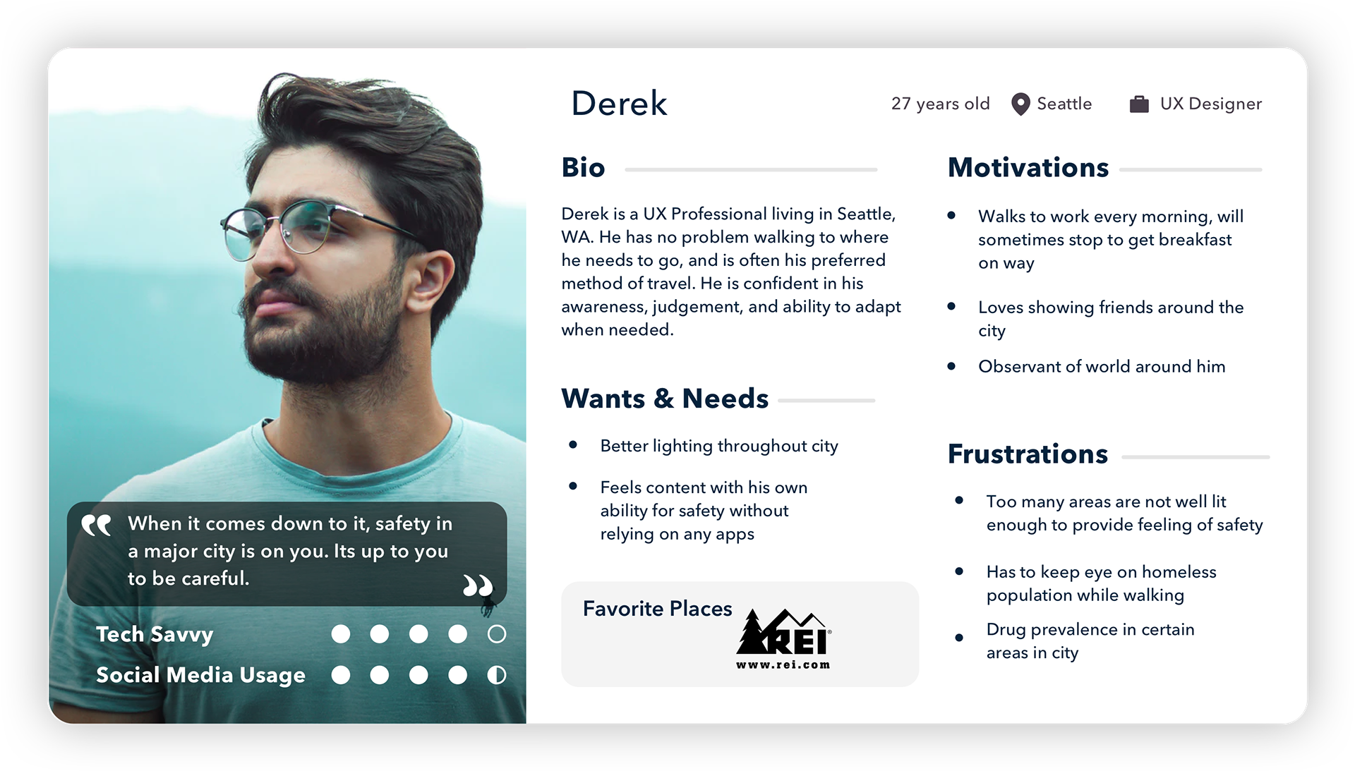

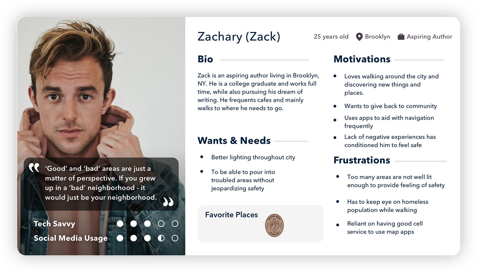
Common pain points for these users were poorly lit areas, needing to keep an eye on the homeless population, and the prevalence of drug use where they travel.
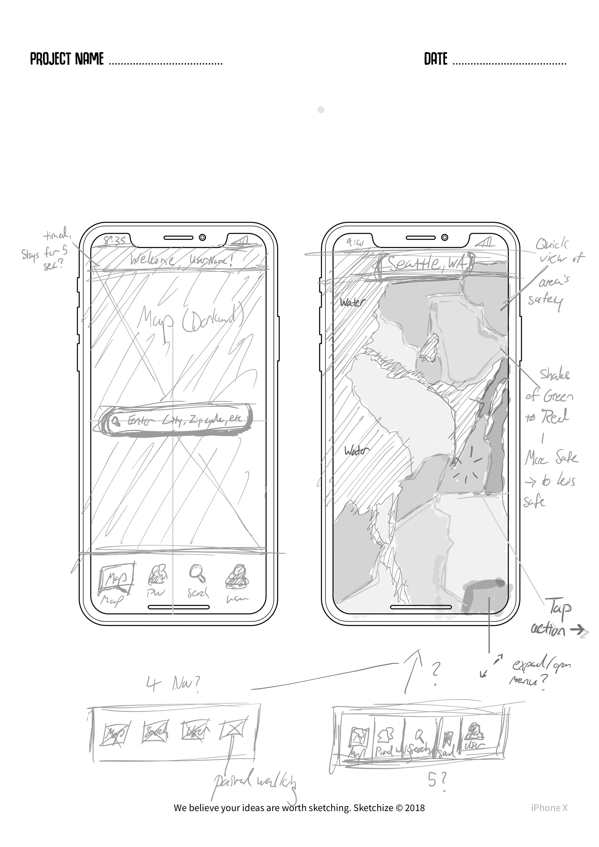
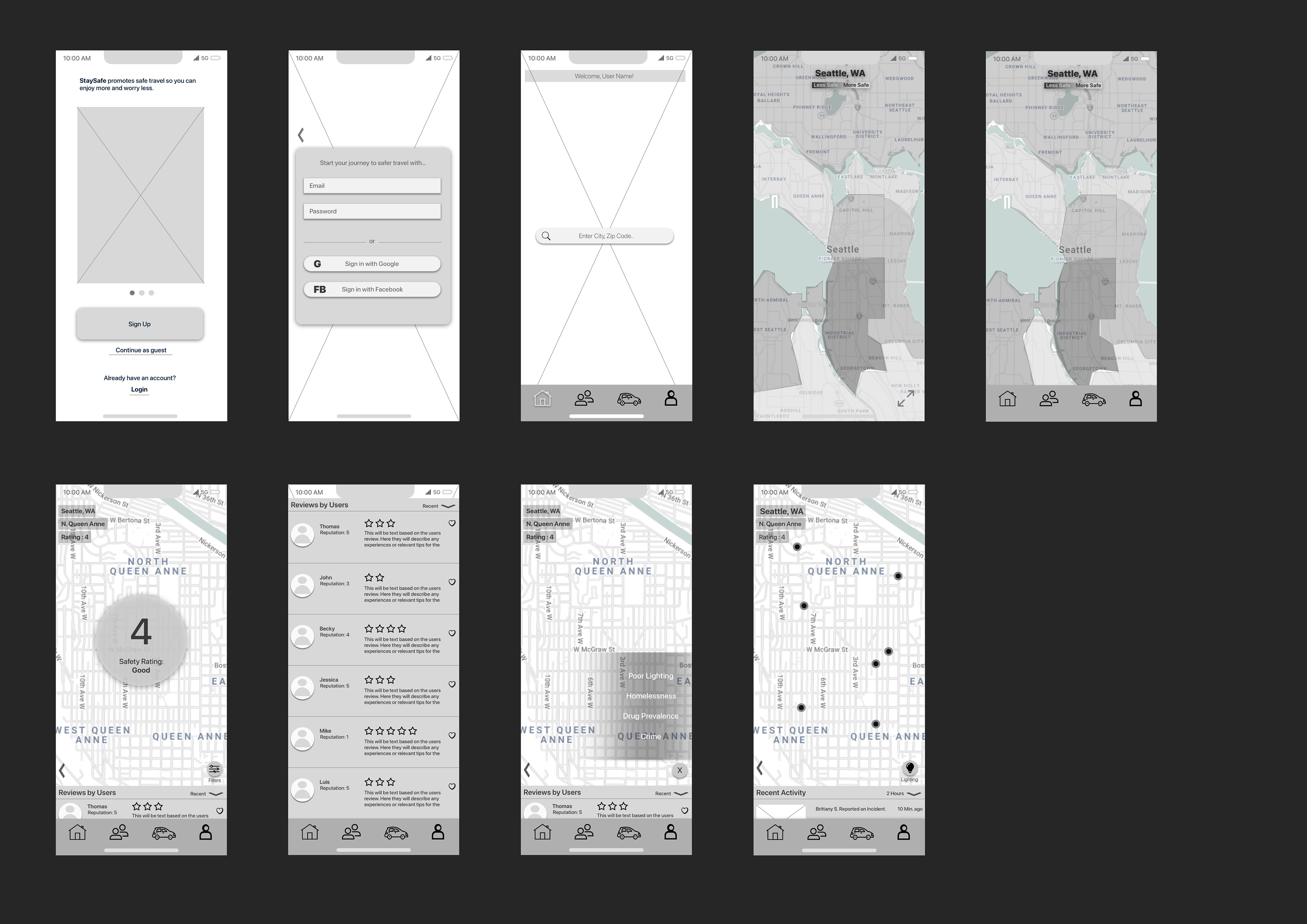
Based on the data gained from my research I wanted to focus on maps as the main feature of the StaySafe app.
The maps will feature Safety Ratings for each area and a simple color-based rating system for quickly viewing multiple areas at once.
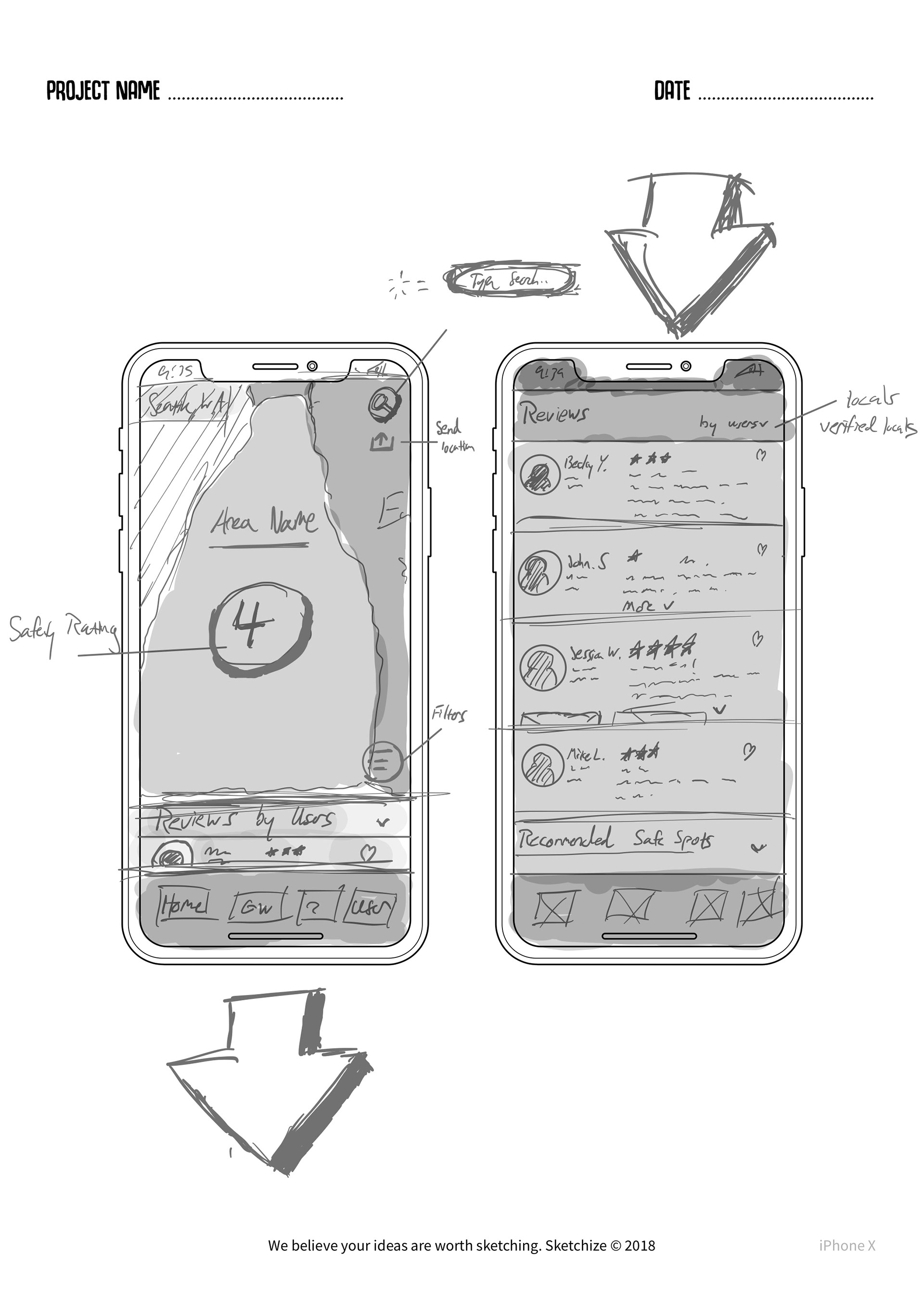
Each area will have user-generated reviews with those who are local to the area having a ‘Verified Local’ badge next to their name.This came as a direct result of an interview where one user mentioned that they wanted,
“real information from people who actually lived there (major city)..”
Multiple users also expressed during interviews that if they felt safety would be a concern, they would try to travel with someone else.
Based on this data, I began conceptualizing a matching feature.
This feature would pair users together who shared similar safety and travel goals to increase their chances of staying safe.
As the saying goes, “There’s safety in numbers.”

Usability Testing - Early Concept
The goal was to find any usability issues in the three red route user flows within the app.
Red Routes:
- Find an areas safety rating
- Match with another user for traveling
- Utilize integrated ride sharing feature
Usability tests were done in-person with my guidance. Users were handed a digital prototype made from single screens and the steps to navigate it.
Throughout the usability tests users generally shared the same concerns and questions. One of the most notable being the clarity of certain screens.
At various points during the user flow some users were unsure of either the screen they were on, or what the purpose of the screen actually was
An example being the ‘giant number 4’ as some called it, or the safety rating assigned to the specific area within a city.

When presented with this screen users either felt confused, or slightly overwhelmed due to the lack of context.
Low-Fidelity Wireframes
Taking in what I observed from the early usability testing, I iterated on screens that needed it.
Example: I provided more context and clarity to the Safety Score by adding a ‘Safety Rating’ descriptor below the number and by adding shadow to separate it from the other elements on screen.
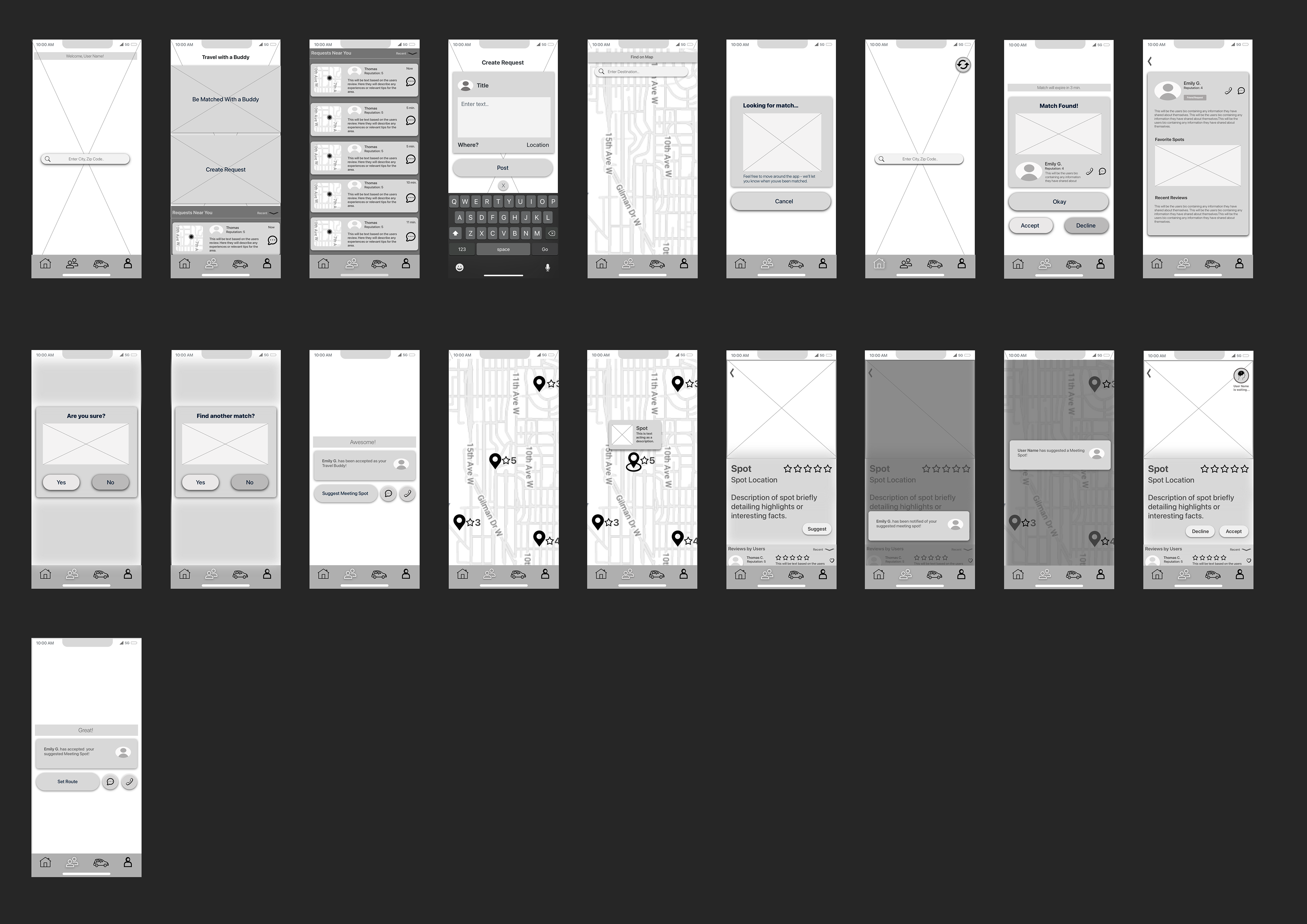
High-Fidelity Wireframes

I started with an Accessibility Audit to ensure color had enough contrast and UI elements like text were readable and easily identifiable.
The original brand color, which was a light purple, was changed to an AA friendly, dark purple.
This provided better contrast to help those with vision needs and those viewing under different external conditions.

Accessibility Audit
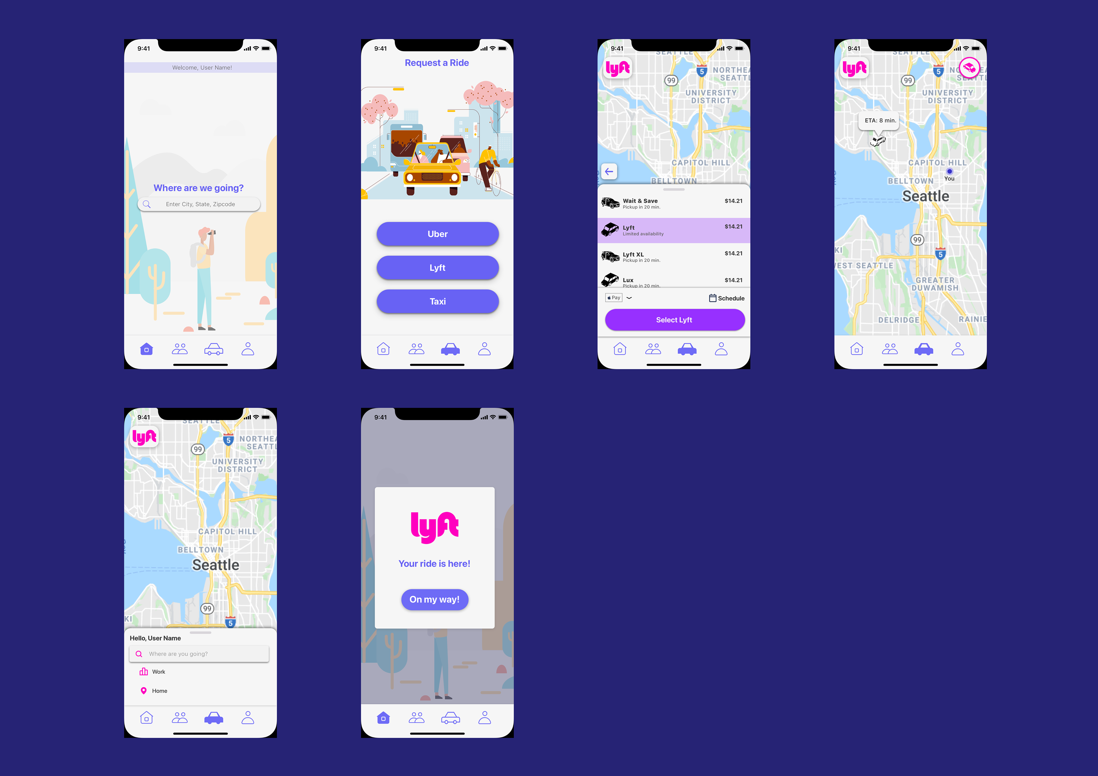
Flow 3 - Ride Sharing
Once all three user flows were established in high-fidelity, it was time to move on to usability testing using a digital prototype of the entire app.
Usability Testing - Prototype
Try out the Prototype!
Using InVision I created an interactable prototype from the high fidelity screens I had made earlier.
I then conducted a remote usability test using the prototype and a test script.
Five users were asked to follow steps for each user flow and give feedback at the end.
During testing I both listened and observed carefully for each user's reaction and behavior while attempting to reach the objective for each user flow.
I was surprised to discover that sections I had thought were clear and intuitive, had ended up being confusing for most users.
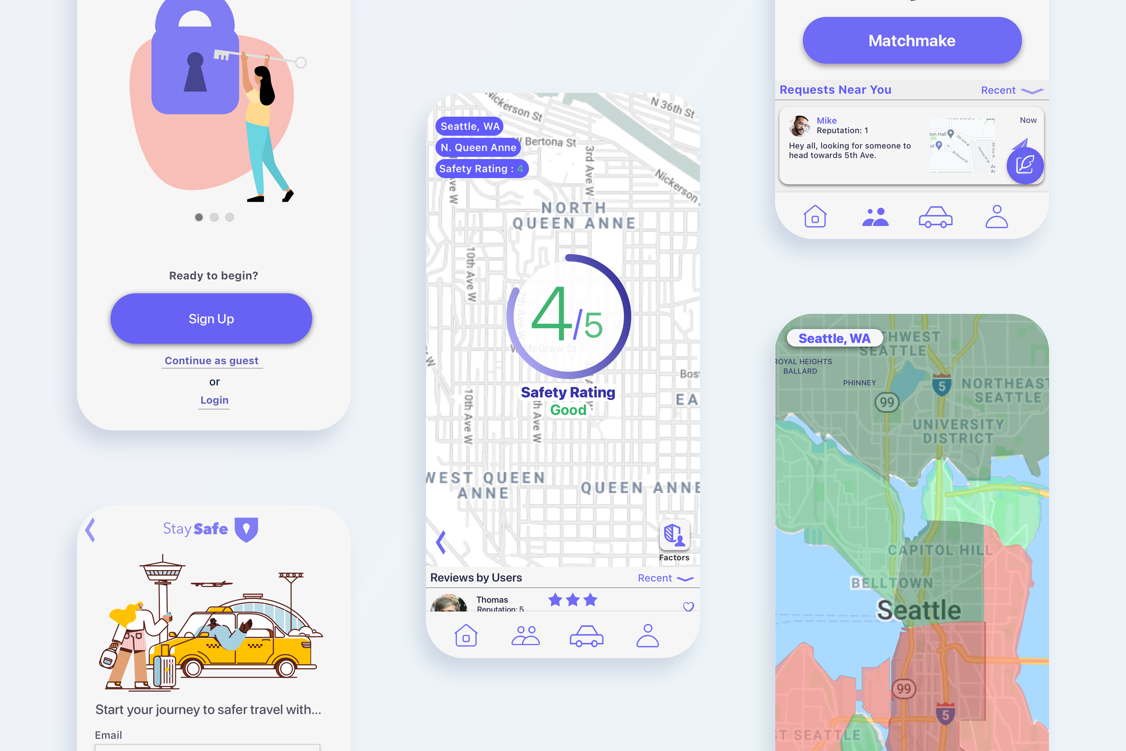
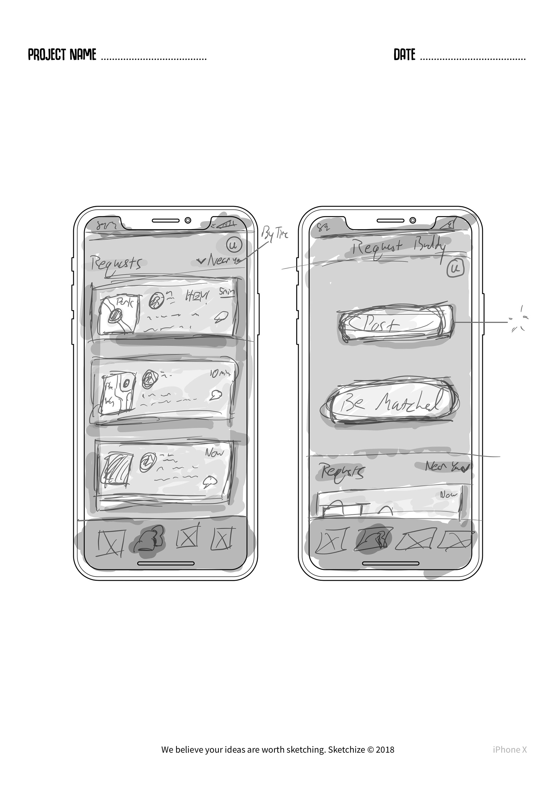
One example being the ‘Travel with a Buddy’ screen:
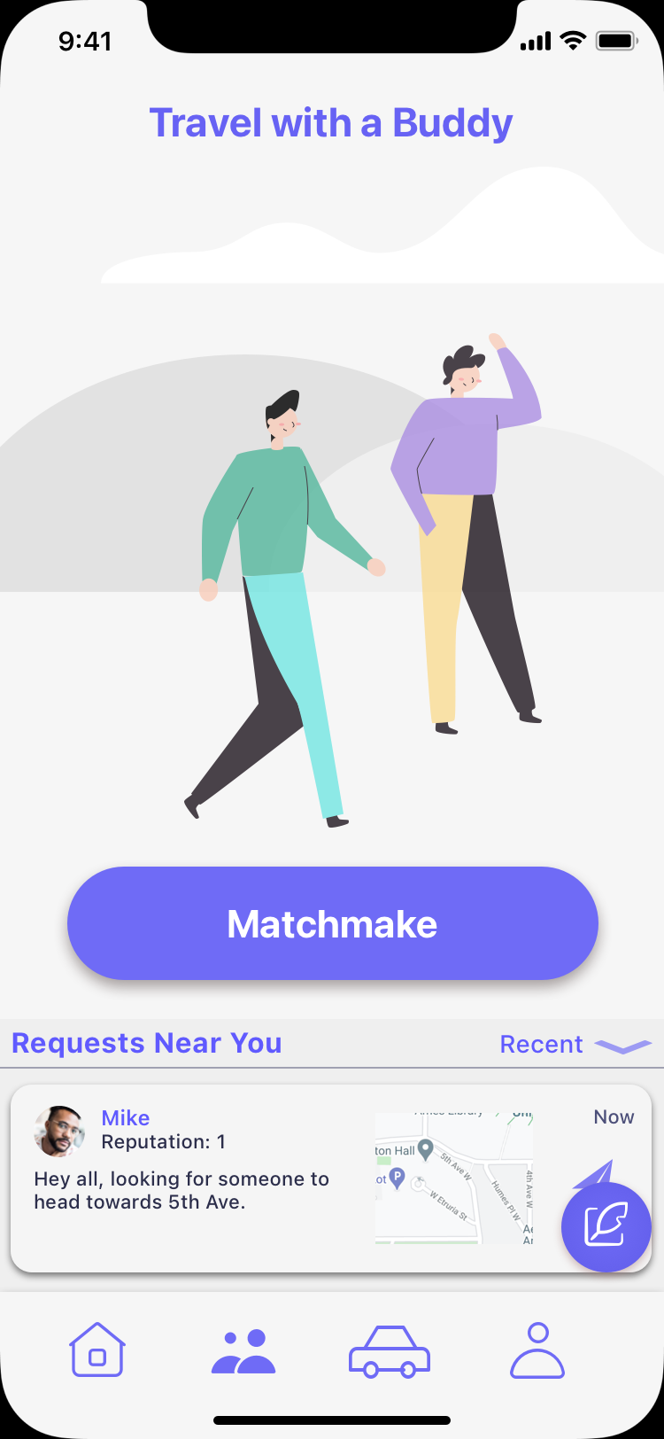
Three out of the five users tested all mentioned that the title and screen were too vague and unclear.
These were not the words I wanted my app to be associated with.
One of the users suggested adding a brief description with the title to help clarify what the feature actually did. As a result of that feedback I designed and positioned a description underneath the title.
Iteration and Final Usability Test
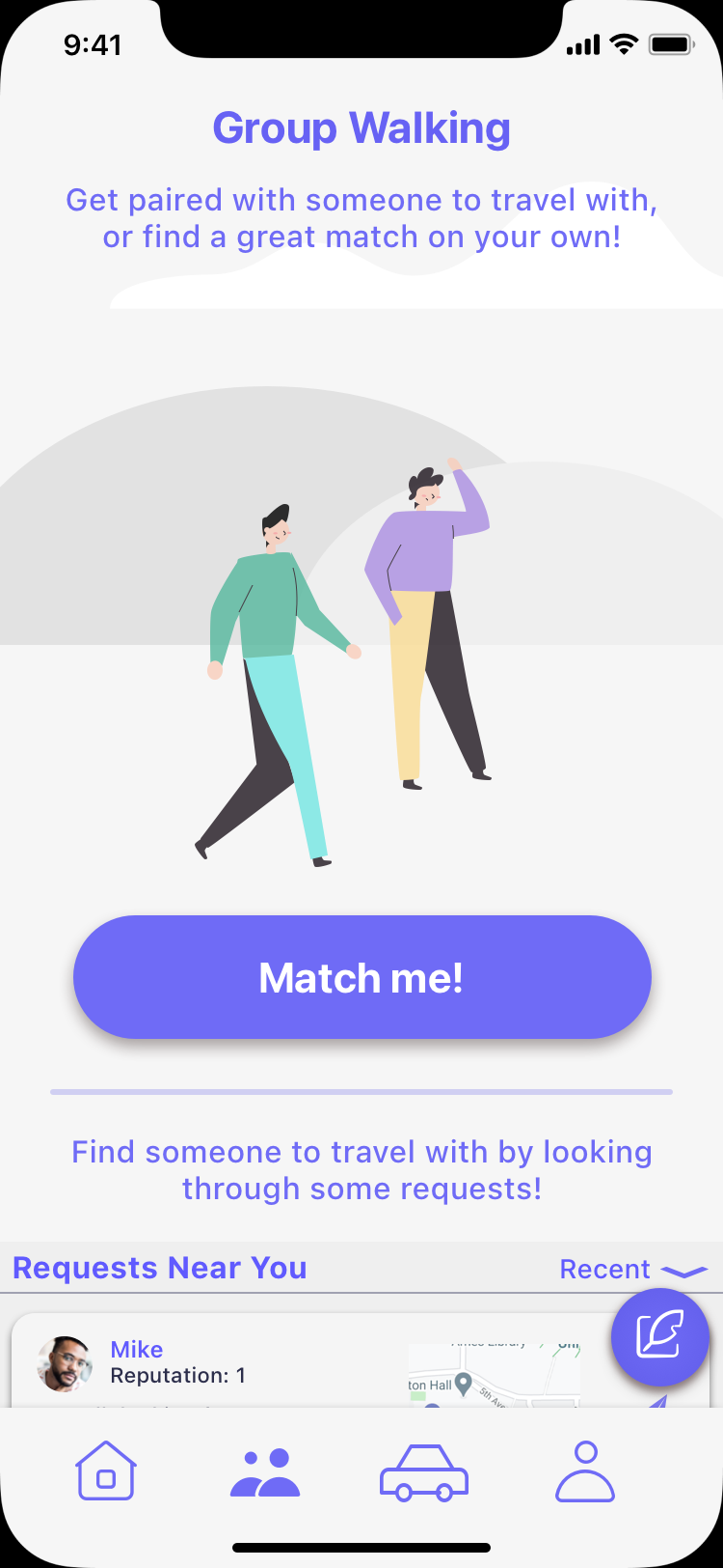
The title ‘Travel with a Buddy’ became ‘Group Walking’ for less confusion and more clarity.
But wait..
Some users were missing the bottom part of this section, or ignoring it completely. If users saw and understood both options provided to them and chose one, then that would be great! That’s the ideal scenario. However, I did not want anyone missing an option that may be more in line with their preferences.
To fix this, a divider with another description was added to both draw attention to, and better explain the ‘Requests Near You’ section.
Success!
On the second round of usability testing, this screen saw 100% improvement!
Every user tested was able to quickly and clearly understand the purpose of the screen. Some even expressed delight and said it was ‘awesome’ to have such a feature available in the app.
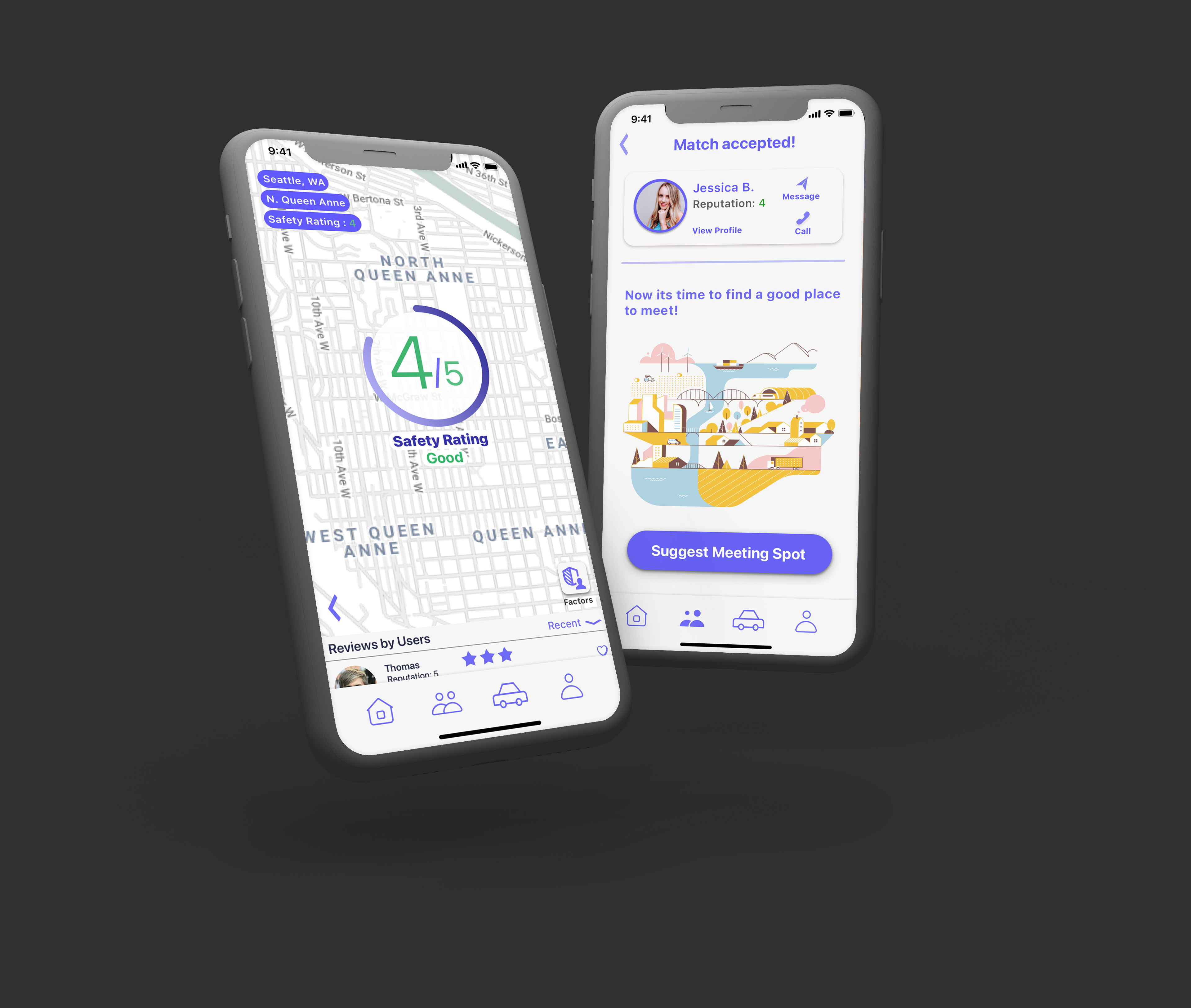
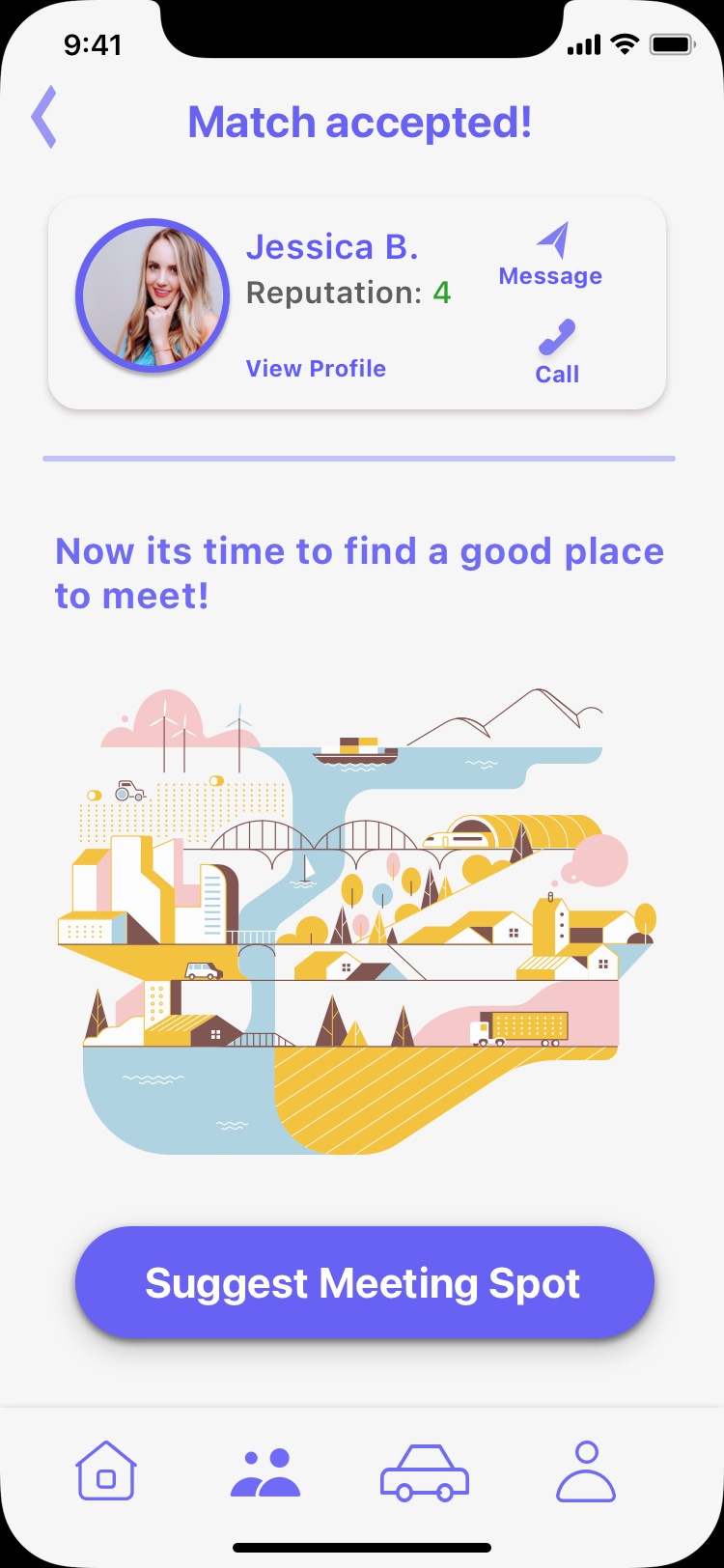
Before and After of Match Accepted screen:
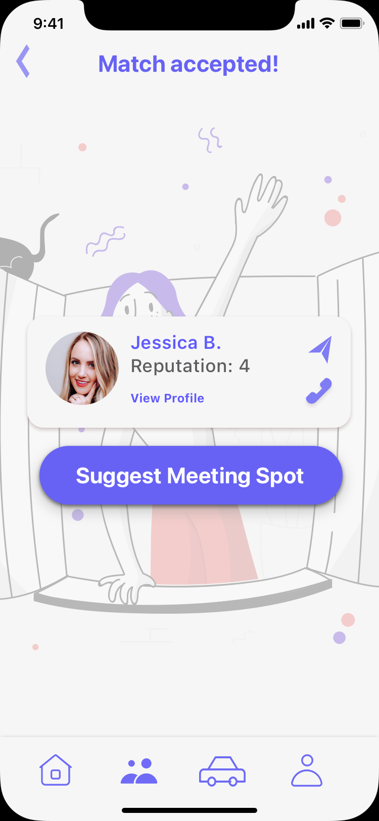
As some users were unsure of what ‘Suggest Meeting Spot’ meant, I added visual and contextual aids.
The second screen retains the important match information up top while dividing the two sections clearly and purposefully. The divider helps to form a logical separation while guiding the user to the next step in the process. The phrase below serves to provide needed context and flow to the visual aid, all while gently guiding the user’s eyes to the CTA (call to action) button on the bottom.
During the first usability test users were abruptly thrown into the next section where they would choose where to meet their match with little to no prep or guidance.
The results are in..
More improvement! On the second round of testing, users were able to better understand where they were headed and why. By providing proper context and guidance, these changes laid a foundation for the next section by instilling confidence through knowledge.
Value
Users found the most value in being able to check the safety of an area through the app’s map feature. Even users who said they most likely wouldn’t use the other features in the app said they would use the map feature.
The most enjoyable feature of StaySafe was the ability to pair and travel with other users in the Group Walking section.
Market Fit & Closing Thoughts
StaySafe helps fill in the currently lacking range of safety-focused, map-based apps available today. Most have very specific or limited features that don’t always apply to the user.
In hindsight, I should have spent more time focusing on the core features of the app instead of trying to fit all of them into the base product. This would have resulted in an even more focused and minimal app.
If I had more time, I would love to continue to iterate and test on more users. I want StaySafe to be the best it can be and provide as much value to our target users as possible.