Project Background
Vlogmi is a social media app passionate about authenticity and mental health with a goal of bringing social media back to what it originally was: a place to "connect, not compare."
They hope to achieve this through a simple yet bold feature: users can only post content taken with Vlogmi's in-app camera.
Project Goals
Vlogmi wanted both a redesign and redesign recommendations for the following pages of their website:
- Landing Page
- Our Mission
- Our Story
- Team Page
Design Team
Joshua Lewis
Cal Hsiao
Nathaniel Richards
Joshua Lewis
Cal Hsiao
Nathaniel Richards
Stakeholder
Rafaella Thorssen - Design VP & Co-Founder
My Role
UX Designer
Responsibilities
Competitor Research
Aid in Landing Page redesign
Our Mission page redesign
Our Story page redesign
Tools
Figma
Project Constraints
My team and I were brought on during one of the final phases of Vlogmi's website redesign. We had to leverage existing data gathered from previous teams.
Timeline
September 2021 - October 2021
Working Hours
40
Project Kick-off Meeting
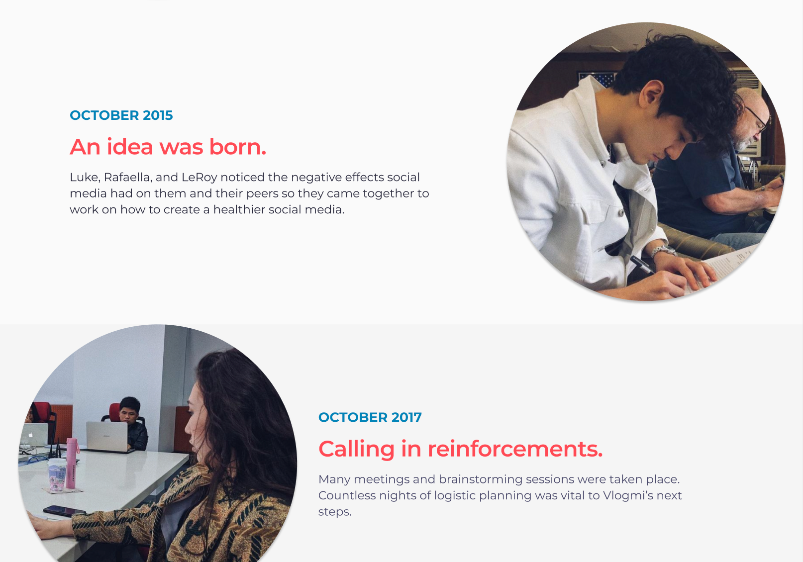
To begin the project the design team met with Vlogmi's VP of Design and Co-Founder, Rafaella Thorssen.
Rafaella began by telling us a little about her company and their mission: to change the current state of social media by providing a healthier, more authentic experience with their mobile app: Vlogmi.
She expressed concerns of Vlogmi's current website feeling "a little too playful", or visually catering to a younger than intended demographic (13-26). After mentioning to her that the current landing page video is not recognizable as such, she stated wanting a more prominent section for it. The meeting wrapped up with the final deliverables being summarized: to redesign the landing, mission, story, and team pages.
Tasks
1. Redesign the website pages to appeal to target demographic (13-26)
2. Create a dedicated section for the landing page video
3. Redesign Landing, Mission, Story, and Team Pages
Research
My team and I decided to start with an analysis of the existing website screens in Figma so we wouldn't be reinventing the wheel.
A lot of data and insights had already been gathered and tested by the previous team, so leveraging it to inform our design decisions was the best option.
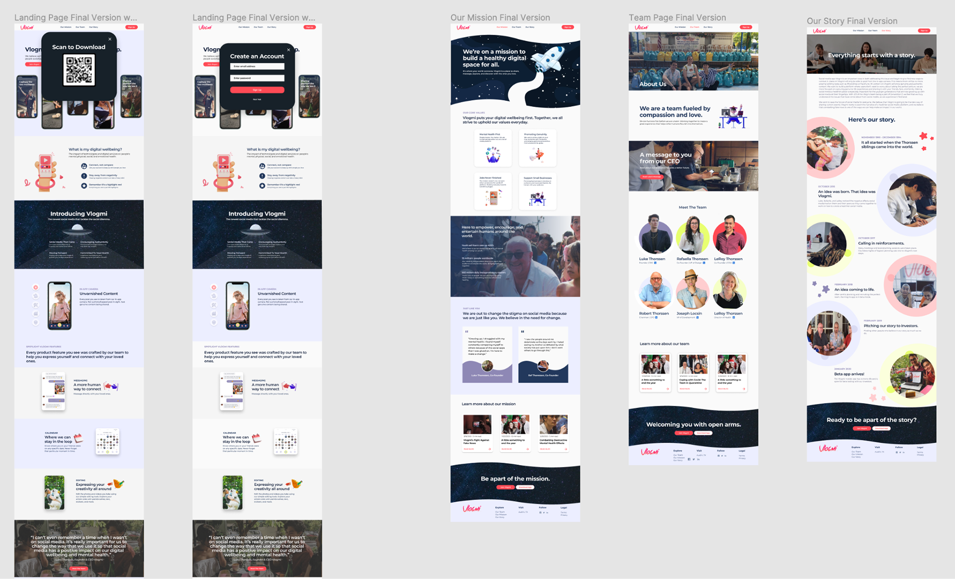
Vlogmi's Existing Screens - Landing Page, Our Mission, Team Page, Our Story
Something our team noticed right away were the inconsistencies of brand colors, and illustrations. There was a lack of Vlogmi's brand red throughout the screens and the supporting visuals felt catered to a younger audience.
Key Insights
1. Lack of Brand Colors
2. Inconsistent visual identity
a. Catered to younger than target demographic (13-26)
4. Section in 'Our Mission' page felt unnecessary and lacked clear purpose
5. Lack of prominent CTAs (Call to Actions)
To get a better idea of what other companies were doing with their sites visually, my team decided to do some competitive analysis.
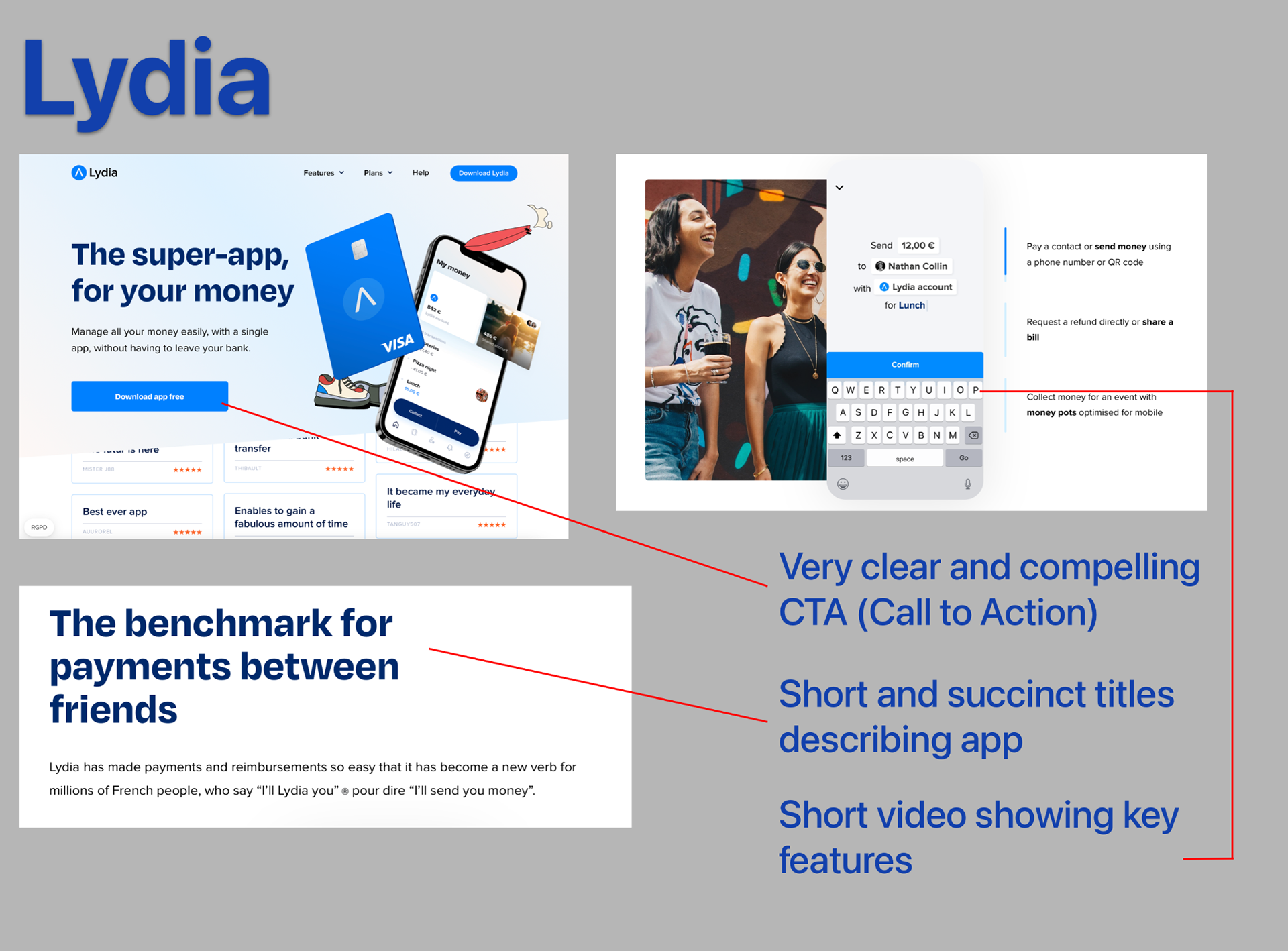
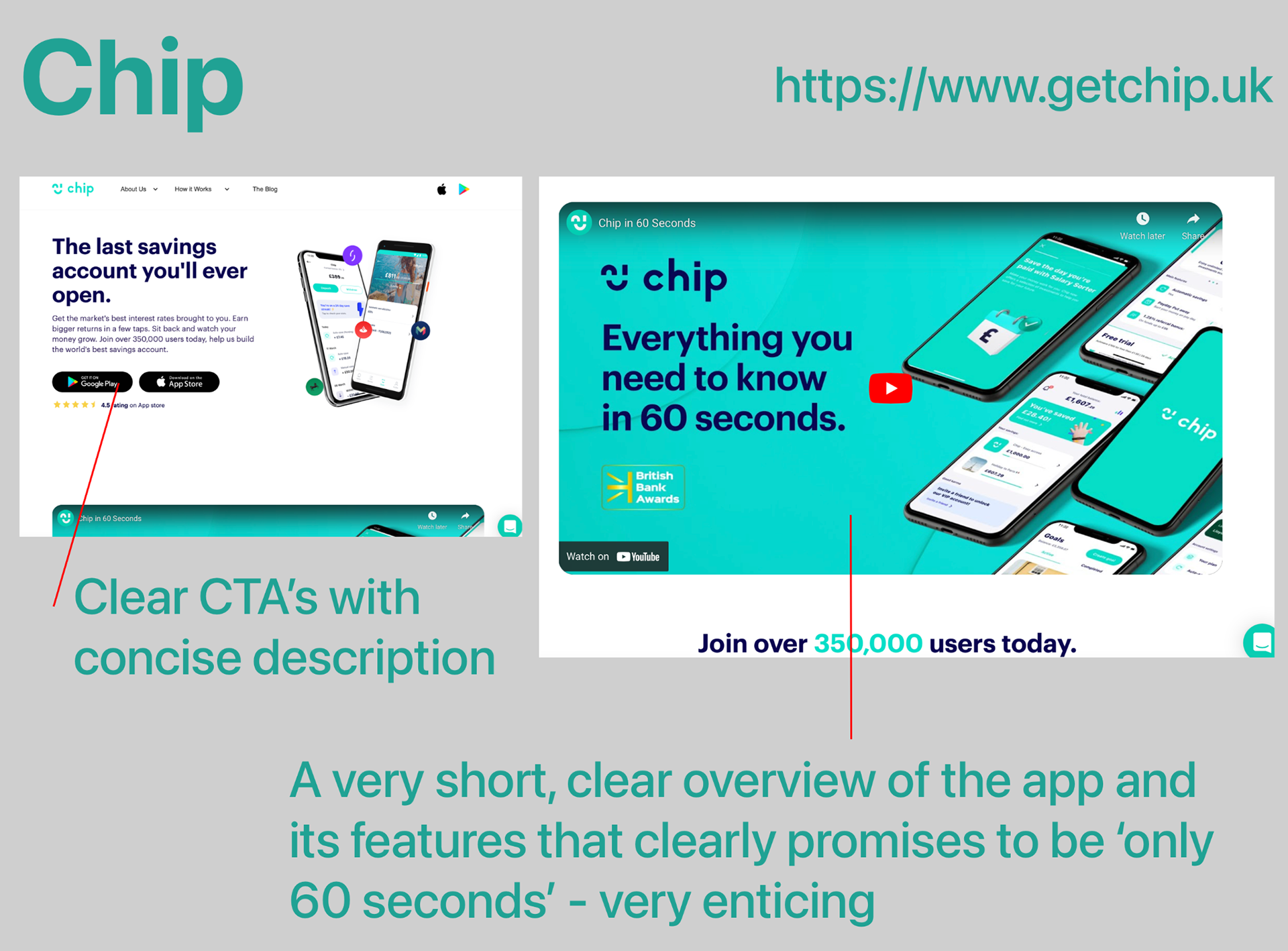
I chose three websites to research:
All three websites shared similar desirable traits: they were minimal, they were modern, and they looked professional. These sentiments were among the goals set by Vlogmi during our meeting.
Summary
- Each site had very clear actions they wanted the user to take, and often at the top of the page
- Brand colors and imagery were abundant and flowed seamlessly throughout site
- They all made it a point to promote their app first and foremost, then explain the why's
- Videos were used to give the user a quick look into both the product and the brand
- Each site made sure to highlight positive feedback: reviews, articles, etc
Ideation
Early in my design process I knew I wanted to focus first and foremost on brand identity.
By establishing a consistent visual theme through repeating brand colors, shapes, and illustrations the user would begin to see Vlogmi as a familiar and reputable company.
To accomplish this, I began with using more of their 'Vlogmi Red' throughout the website pages while adjusting and creating new CTAs for the user to interact with. Larger CTAs using Vlogmi's eye-catching red will help users quickly identify opportunities to take part in Vlogmi's mission.
Design
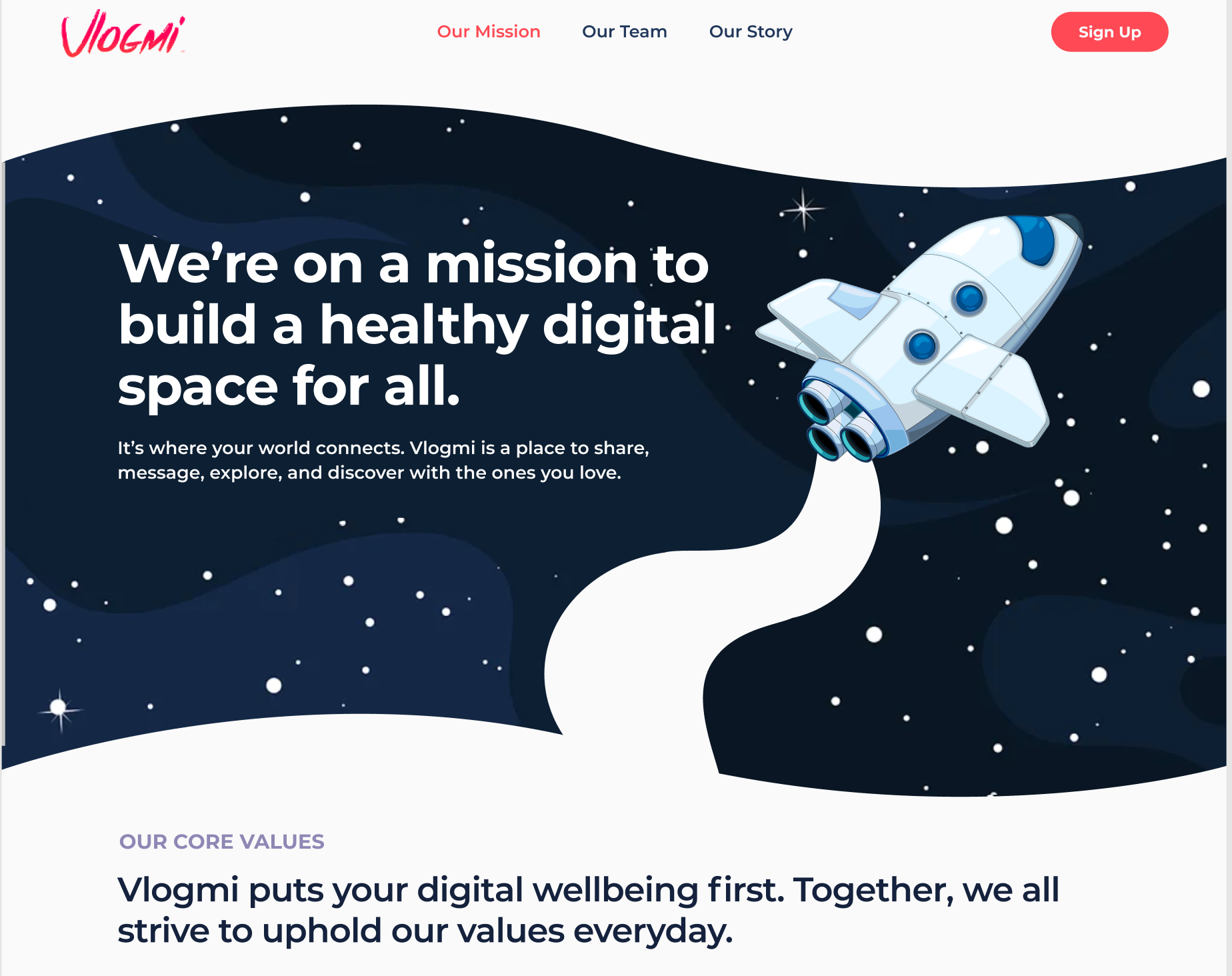
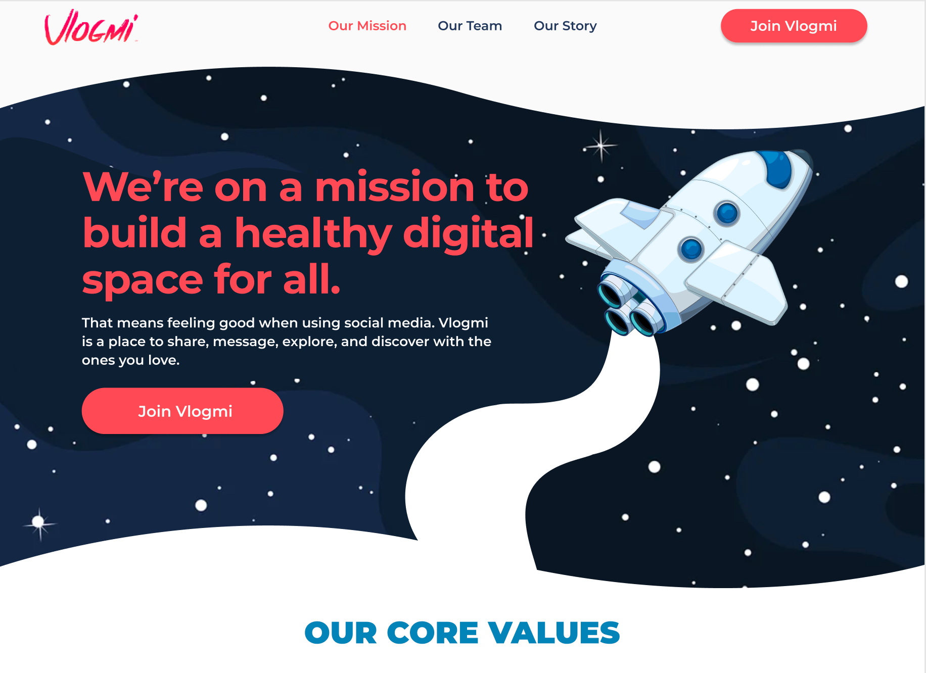
By adding a very prominent CTA in the 'Join Vlogmi' button and leveraging brand colors, I was able to create a call-response from Vlogmi to the user. If the user agrees with their mission statement they can quickly and easily answer the call to action and join Vlogmi's movement for a healthier social media landscape.
Key Changes
1. Added larger CTA on top navigation
2. Added main CTA in Page Banner
3. Applied brand color red to banner text
Our Mission Page - Middle
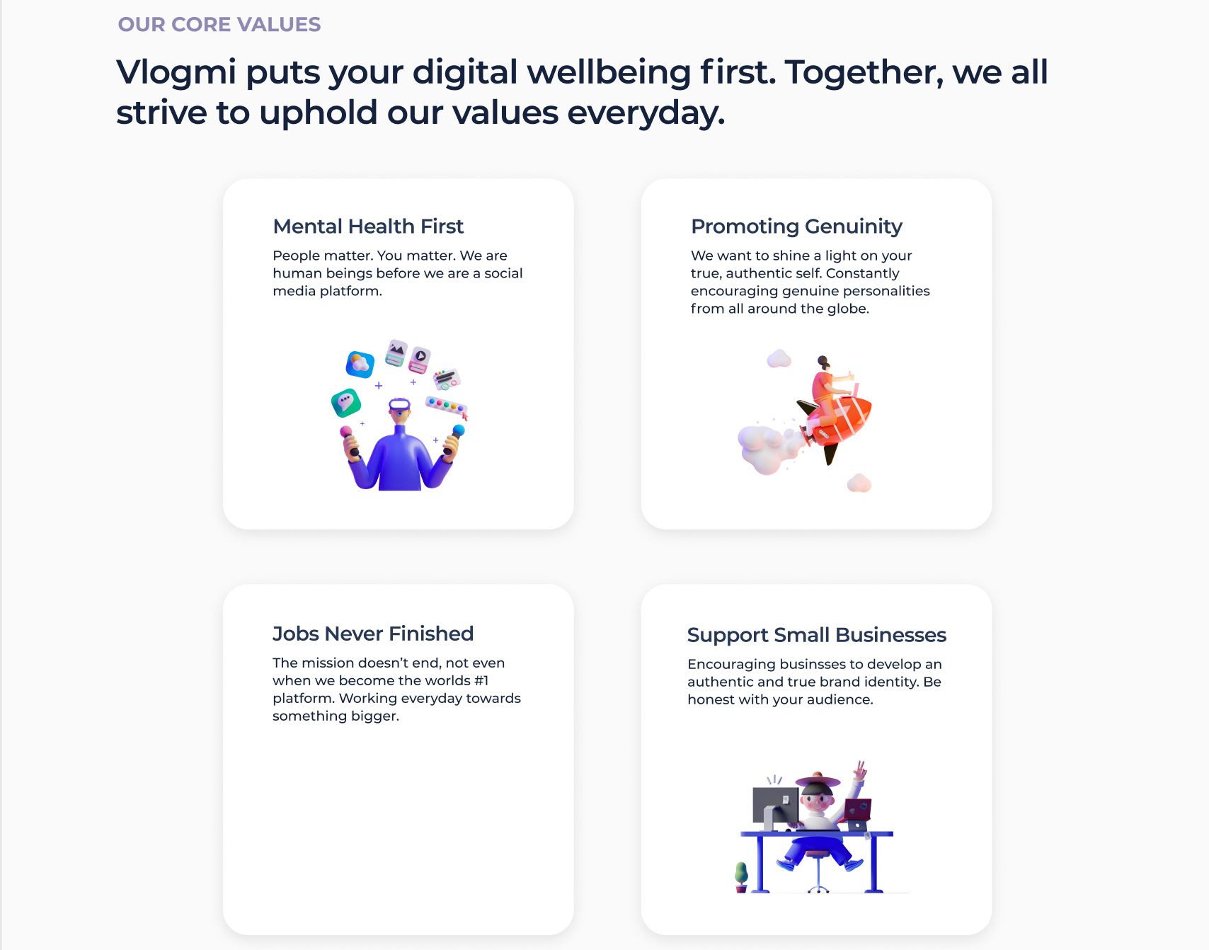
Before
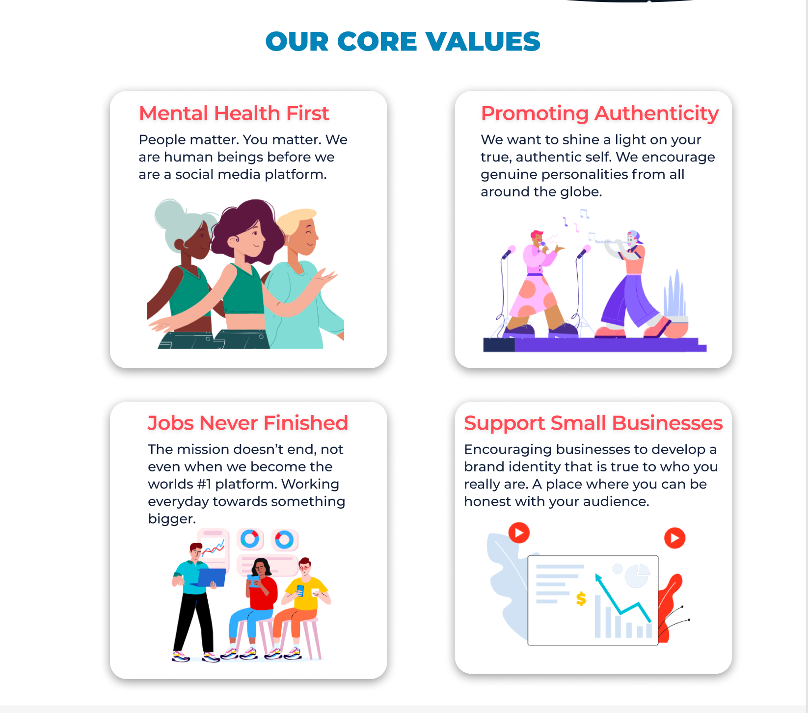
After
Key Changes
1. Simplified 'Our Core Values' section while adding complementary blue to text
2. Replaced 3D illustrations with more consistent and on-brand imagery
3. Adjusted visual hierarchy by bringing attention to the titles of each card while implementing brand colors to catch user's eyes and ground them in the site
Before
After
Key Changes
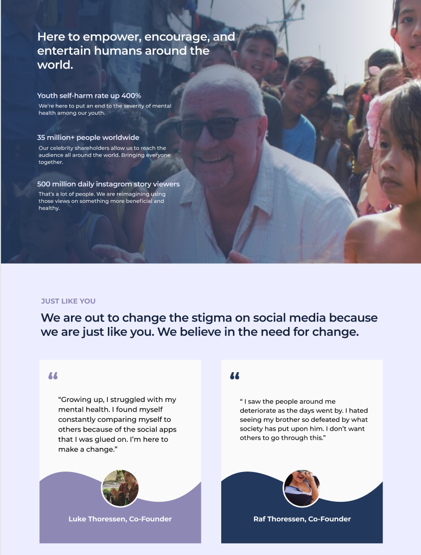
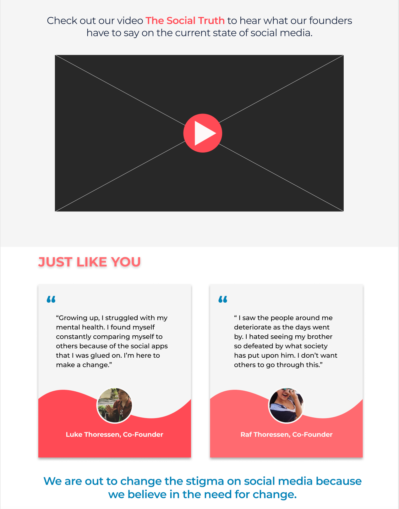
1. Replaced section featuring facts and statistics that had an unclear purpose with a simple, inviting promotion of Vlogmi's video, 'The Social Truth'
2. Reordered content to benefit visual hierarchy and promote brand consistency: added brand red and blue and removed off-brand purple - made title prominent

Before
After
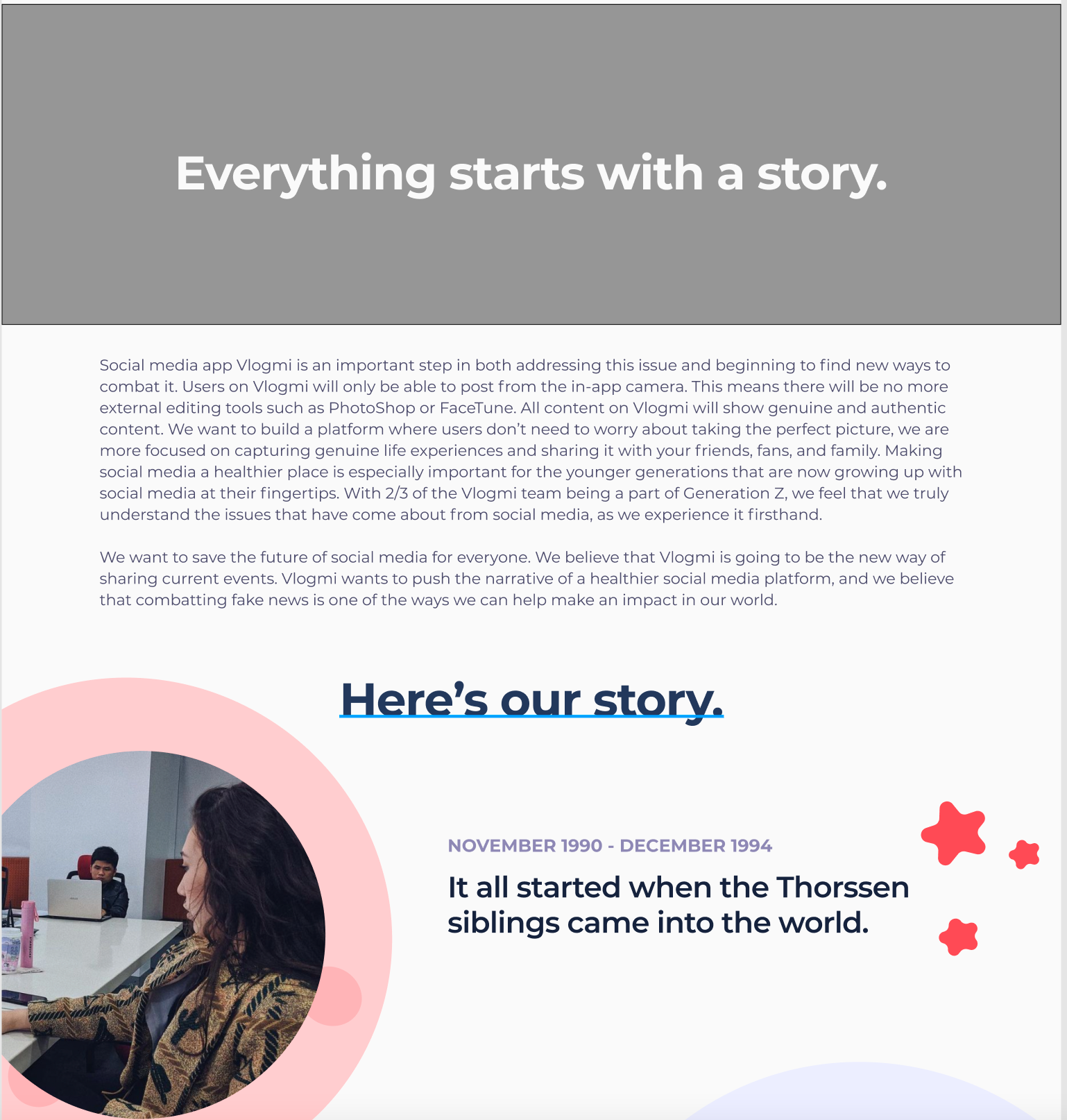
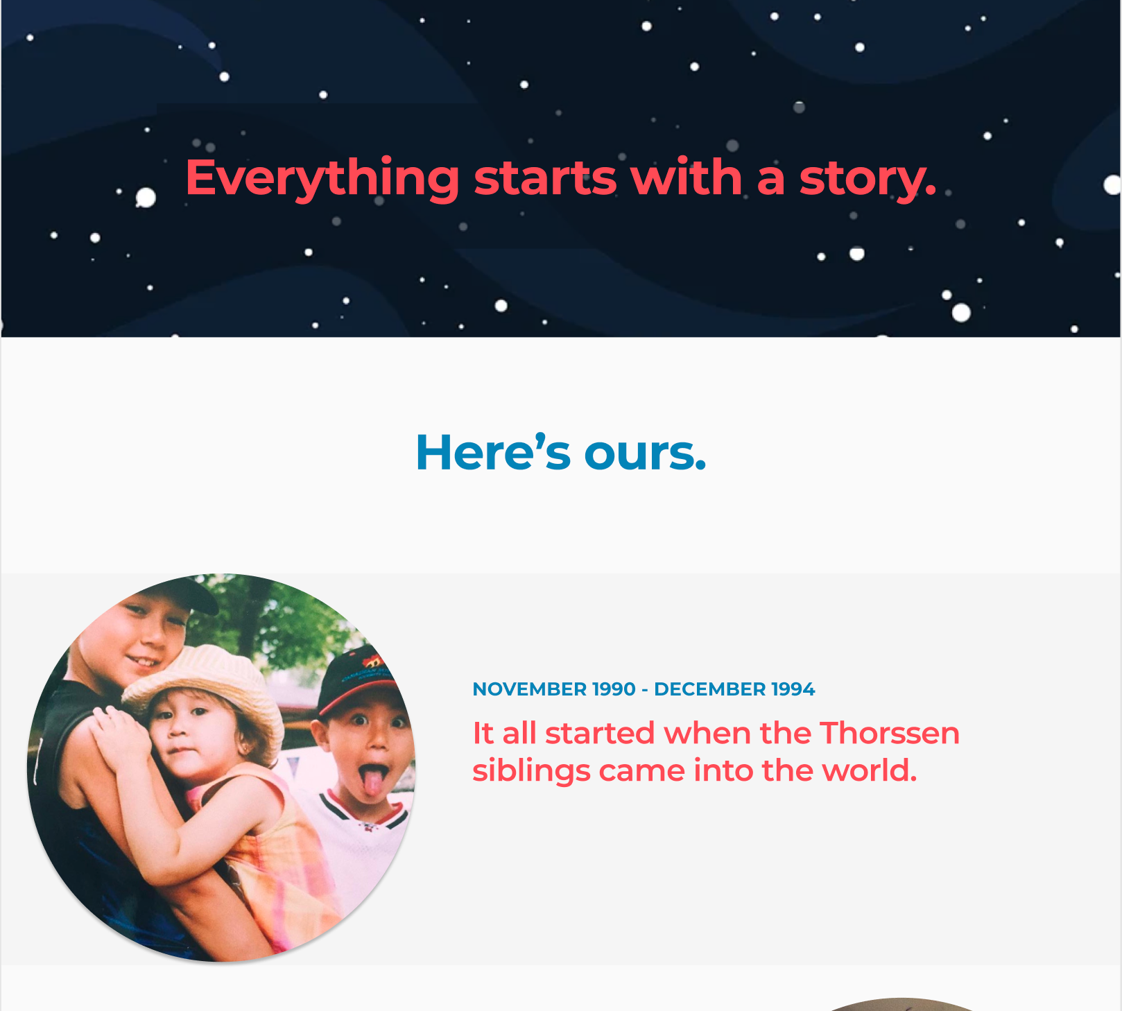
By removing the illustrations and replacing them with a clear, alternating white and gray background I was able to highlight the important elements of the page with negative space and promote consistency with the rest of the site. This also helped raise the age demographic to what it was intended to be, as per the Vlogmi's request.
Key Changes
1. Replaced large block of text at top of page with simple and inviting hook
2. Removed illustrations and gave background theme of alternating white and gray
3. Replaced first image with a more relevant one - featuring the siblings
4. Replaced off-brand colors with on-brand red and blue
Results
While my team and I did not have enough time to conduct usability testing of our iterations, we did present them to Vlogmi's head of design - Rafaella Thorssen.
Rafaella was pleased with the designs, saying they looked "much better" than the previous iterations. She liked the new theme so much that she specifically requested the other pages follow the new design scheme moving forward.
At the start of this project we set out to accomplish three main goals:
1. Redesign the website pages to appeal to target demographic (13-26)
2. Create a dedicated section for the landing page video
3. Redesign Landing, Mission, Story, and Team Pages
By the end of our time with Vlogmi all were accomplished by:
1. Leveraging existing user data and conducting a competitive analysis
2. Applying and modifying brand identity to promote consistency and familiarity
3. Team collaboration and weekly sharing with stakeholder VP Design Rafaella
4. Using UX principles such as visual hierarchy, user feedback, best practices, and rapid iteration
In Closing
Vlogmi is a company pioneering for mental health in the social media landscape and are a group of hard-working and passionate people. It was an honor to work with Rafaella and my design team to be able to provide an impact to users through Vlogmi's admirable mission.


